
Ключевые выводы и инсайты
- Маленькие детали и продуманные анимации существенно повышают качество пользовательского опыта и делают приложения заметно лучше стандартных iOS-приложений.
- Интерактивность и анимации оживляют интерфейс, добавляя глубину и удовольствие от использования.
- Кастомные иллюстрации, особенно для пустых состояний, придают приложению уникальность и индивидуальность.
- Тактильная отдача (haptic feedback) увеличивает вовлеченность пользователей, делая взаимодействие приятнее и «живее».
- Правильно подобранные иконки и их стилизация сильно влияют на восприятие приложения и помогают сделать интерфейс цельным и профессиональным.
- Постоянное изучение и вдохновение от лучших дизайнерских решений — ключ к улучшению собственного дизайна.
Практические стратегии
- Добавляйте анимации при смене вкладок или страниц (например, слайдинг), чтобы интерфейс выглядел живее.
- Для сложных анимаций разбивайте задачу на отдельные подзадачи (суб-анимации) и создавайте их поэтапно, используя инструменты ИИ (например, Claude Code).
- Используйте кастомные иллюстрации для пустых экранов, можно создавать базовые образы у художника и генерировать вариации с помощью ИИ (например, ChatGPT).
- Рассмотрите анимацию иллюстраций с помощью инструментов типа Rive для дополнительного эффекта.
- Внедряйте тактильную отдачу, регулируя интенсивность вибрации в зависимости от действия (легкая для частых кликов, сильная для важных переключений).
- Выбирайте иконки, подходящие по стилю к общему дизайну приложения; придерживайтесь консистентности в стиле и используйте разные стили для активных и неактивных состояний.
- Для повышения дизайнерского вкуса регулярно просматривайте работы других дизайнеров и вдохновляйтесь на платформах типа Twitter и Mobin.
Конкретные детали и примеры
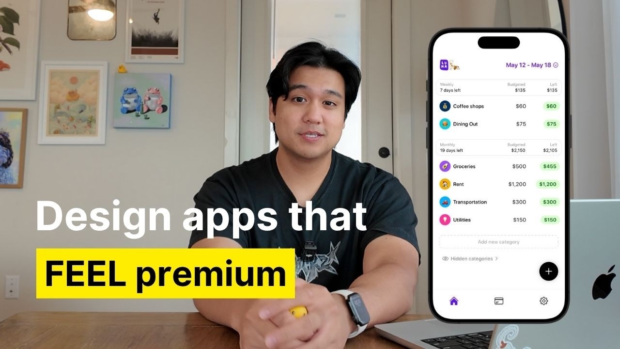
- В приложении Luna анимация смены вкладок реализована в виде слайда с предыдущей страницы (заняло 5 дней разработки без ИИ, сейчас можно сделать за час с Claude Code).
- В приложении Ellie реализована сложная анимация кнопки отправки: вращение кнопки в галочку, расширение фона от микрофона, плавное появление текста с эффектом пружины.
- Для кастомных иллюстраций в приложении Lily используется маскот-призрак Lily, который с помощью ИИ генерирует различные вариации для пустых состояний и активных сценариев.
- Использование иконок из набора Hero Icons (тонкая версия) в приложении Luna — минималистичный и чистый вид, различие между тонкими и толстыми версиями иконок значительно меняет восприятие интерфейса.
- Сайт Mobin — ресурс для просмотра тысяч скриншотов приложений и поиска дизайнерского вдохновения.
- Тактильная отдача используется почти на всех кнопках в приложении Luna с разной интенсивностью.
Предостережения и распространённые ошибки
- Не стоит пытаться создать сложную анимацию одним запросом к ИИ — лучше разбить её на части и создавать поэтапно.
- Использование одинаковых иконок разных стилей в одном интерфейсе снижает целостность и качество дизайна — важно придерживаться единого стиля.
- Слишком частое или сильное использование тактильной отдачи может раздражать пользователя, важно дозировать её.
- Стандартные iOS-приложения часто избегают анимаций и тактильной отдачи из-за соображений доступности и производительности — учитывайте эти аспекты, но не бойтесь экспериментировать для меньших аудиторий.
Ресурсы и последующие шаги
- Claude Code — инструмент для генерации кода анимаций с помощью ИИ.
- ChatGPT — для генерации вариаций иллюстраций и подсказок для кастомизации.
- Rive — инструмент для анимации векторной графики.
- Hero Icons — бесплатный набор иконок с различными стилями.
- Mobin (https://mobin.design) — площадка с тысячами скриншотов приложений для вдохновения.
- Twitter — подписка на дизайнеров для постоянного вдохновения.
- Рекомендации: начать с изучения базового процесса дизайна (мудборды, вайрфреймы), затем поэтапно внедрять описанные техники.
- Следить за автором (Chris) в Instagram и TikTok для получения регулярных советов по разработке продуктивных приложений.
Основные темы
- Улучшение пользовательского опыта через анимации и интерактивность.
- Использование ИИ для создания анимаций и кастомных иллюстраций.
- Значение тактильной отдачи в мобильных приложениях.
- Важность выбора иконок и их стиля в дизайне интерфейса.
- Постоянное обучение и вдохновение для повышения качества дизайна.
- Практические советы по реализации сложных анимаций с помощью ИИ.