 YouTube Deep Summary
![]() Extract content that makes a tangible impact on your life
Extract content that makes a tangible impact on your life
How I Make Apps FEEL 10x Better (5 Design Secrets)
Chris Raroque • 2025-07-07 • 11:39 minutes • YouTube
📚 Chapter Summaries (7)
🤖 AI-Generated Summary:
Ключевые выводы и инсайты
- Маленькие, продуманные детали и анимации могут значительно улучшить восприятие приложения и сделать его более приятным и «живым» по сравнению с дефолтным iOS интерфейсом.
- Добавление анимаций при переключении вкладок и сложных взаимодействиях повышает вовлечённость пользователей и создаёт ощущение премиальности.
- Использование кастомных иллюстраций (особенно для пустых состояний) придаёт приложению индивидуальность и выделяет его среди конкурентов.
- Гаптическая обратная связь (вибрация при взаимодействии) усиливает чувство вовлечённости и удовольствия от использования приложения.
- Внимание к выбору и стилистике иконок влияет на общее впечатление и качество дизайна.
- Постоянное обучение и вдохновение, например, через просмотр работ других дизайнеров и использование специализированных ресурсов, помогает развивать чувство стиля и улучшать дизайн.
Практические стратегии
- Анимация взаимодействий: разбивать сложные анимации на составные части (например, вращение кнопки, изменение фона, плавное появление текста) и создавать их поэтапно, используя инструменты вроде Claude Code.
- Кастомные иллюстрации для пустых состояний: создавать базовый маскот (лучше с помощью художника), затем генерировать его вариации через AI (например, ChatGPT) для разных сценариев пустых экранов.
- Анимация иллюстраций: использовать инструменты вроде Rive для оживления статичных изображений, добавляя интерактивности.
- Гаптическая обратная связь: применять разную интенсивность вибрации в зависимости от действия (например, лёгкая при вводе данных, более сильная при смене вкладок).
- Выбор иконок: выбирать иконки в одном стиле (тонкие, тяжёлые, минималистичные) и последовательно использовать их по всему приложению; для активных элементов использовать более насыщенный стиль иконок для выделения.
- Вдохновение и обучение: регулярно просматривать дизайнерские работы на платформах Twitter и Mobin, чтобы узнавать актуальные тренды, искать идеи и ответы на конкретные вопросы по дизайну.
Конкретные детали и примеры
- Пример анимации в приложении Luna: переключение вкладок с эффектом слайдинга страницы вместо мгновенного появления.
- Пример сложной анимации в приложении Ellie: кнопка отправки поворачивается в галочку, фон расширяется из микрофона, текст плавно исчезает с эффектом «пружины».
- Использование AI (Claude Code) для создания анимаций без написания кода вручную.
- Иллюстрации маскота Lily для пустых состояний в приложении для встреч, с вариациями (поиск, заметки, сон, кофе, прогулка с собакой).
- Пример использования разных стилей иконок (тонкие и толстые) в приложении Luna, где выбран тонкий стиль с переходом к более тяжёлому при активном состоянии.
- Ресурс Mobin — библиотека с тысячами скриншотов приложений для вдохновения и изучения лучших практик.
Предупреждения и распространённые ошибки
- Не пытайтесь создавать сложные анимации за один запрос к AI — нужно разбивать задачу на мелкие шаги и компоненты.
- Частое и неуместное использование гаптики может раздражать пользователей, важно дозировать силу вибрации.
- Непоследовательное использование иконок разных стилей нарушает целостность дизайна и ухудшает впечатление от приложения.
- Использование стандартных иконок SF Symbols без адаптации и кастомизации делает приложение менее уникальным.
- Избегать слишком статичных интерфейсов без анимаций и интерактивности, чтобы не терять интерес пользователей.
Ресурсы и дальнейшие шаги
- Claude Code — AI-инструмент для генерации кода анимаций на основе текстовых описаний.
- ChatGPT — для генерации вариаций иллюстраций и маскотов.
- Rive — инструмент для анимации векторных иллюстраций.
- Mobin (https://mobbin.design) — ресурс с тысячами скриншотов лучших приложений для вдохновения.
- Twitter — для подписки на талантливых дизайнеров и постоянного обучения.
- Рекомендация: найти художника или иллюстратора для создания базовых персонажей и иллюстраций.
- Ознакомиться с базовым видео автора про mood boarding и wireframing (ссылка в описании видео).
- Подписаться на Instagram и TikTok автора для регулярных советов по созданию продуктивных приложений.
Основные темы
- Улучшение пользовательского опыта через анимации и интерактивность.
- Использование AI для создания дизайна и анимаций.
- Кастомные иллюстрации и их вариации для персонализации приложения.
- Важность гаптической обратной связи.
- Выбор иконок: стиль, последовательность, выделение активных элементов.
- Постоянное обучение и поиск вдохновения в дизайне.
- Практические советы и примеры из реальных приложений автора (Luna, Ellie, Lily).
📝 Transcript Chapters (7 chapters):
📝 Transcript (404 entries):
You guys were really curious to hear about how I design my apps and specifically how I make them feel 10 times better than the default iOS experience. I get a ton of compliments on my app saying that they just feel different, a little bit more polished, more fun to use. So today I'm breaking down some of the advanced techniques I use to achieve that. If you're new here, welcome to the channel. My name is Chris and I build productivity apps. I already made a video covering the basics of my design process like mood boarding and wireframing, but today we're going to be going a little bit deeper. These are practical things that I'm doing and applying to my own apps to really give them that polished and fun to use feel.
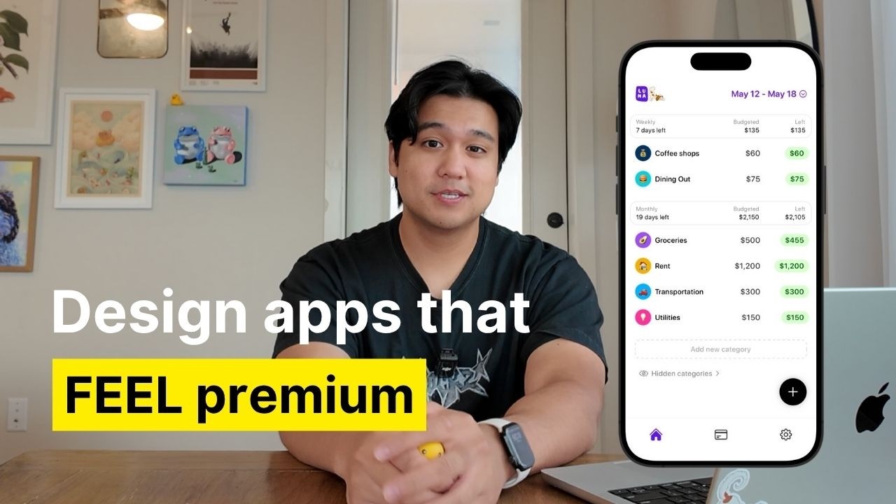
Another way to add dimension to your app is to make it more interactive and just have a little bit more movement. Most apps are pretty static. When you're clicking on tabs in any of the default Apple apps, they kind of just appear instantly. There's no animation, probably for a good reason. They're serving a billion users. Maybe it's a motion sickness thing or an accessibility thing, but again, we're not Apple. So, what I like to do is try to add animation anywhere I feel is appropriate. So, for example, in my app Luna, I could have made it where when you're switching between the tabs, it just instantly appears like all of the default iOS apps, but instead, I decided to actually animate that page change.
When you're switching between different pages, they actually slide over from the previous page. I'll slow it down so you can see this animation better. Granted, this did take me like 5 days to build because I didn't have AI at the time, but I think now with Claude Code, you can actually get something done like this in less than an hour. Here's an even better example of where I went a little bit above and beyond on the interactions. So, I have this feature in Ellie where you can dictate tasks to the AI assistant that I built. So, something I spent a lot of time on was a custom animation sequence. When I slow it down, you can see a lot of things are happening here. The send button rotates into a check mark. The background expands from the microphone and the listening text fades with this kind of spring animation. And all of this stuff adds up to a really satisfying animation that I think adds a little bit more to the experience. This might seem small, but if you do this a 100 times throughout your app, it's going to add up to this very premium experience, which again makes your app feel way better than the default iOS apps.
Something I want to point out, too, is that a lot of this stuff is actually not as hard as you might think. The cool part is I actually just vibe coded this completely with cloud code. I didn't write a single line of code for this.
I'll give you a tip. When it comes to complex interactions like this, don't try to oneshot this and say, "Hey, can you go animate this for me?" Because it's not going to come up with anything this cool and complex. For this one, I had to break down all the sub animations that I wanted to happen. Can you make the arrow rotate into the check mark?
Can you have that background expand from the microphone? Can you add some of this fade in fade out for the text? So, I broke down all the components I wanted to happen in the interaction and it just executed it for me flawlessly. Apple has a really good built-in API for animations and Claude Code and a lot of AI coding tools are very well trained on it. So, you can actually just tell it to do this stuff for you in plain English and it has a really high chance of doing it. But again, the trick is to not oneshot it and to instead break it down into steps.
Tip number two is custom illustrations, especially for things like empty states. So, this is when your app has no data in it and it's just kind of an empty screen. A lot of apps just have a text that say there's no task for today or something like that. I want to go a step beyond that. Add custom illustrations or even animations to those empty states.
This is something you can actually do with the AI tools on the market. So, in my case, for my app, Lily, which is a meeting assistant app, I have this ghost mascot. What's really cool with AI tools like chat GPT, you can actually take a base mascot like Lily, feed it into chat GPT, and with the right prompts, you can actually generate almost an infinite amount of variations of this mascot. I actually used it to generate the empty state for the search page. Now, instead of it just saying there's no meetings here, instead there's this illustration of Lily the Ghost searching for tasks.
Or if there's an active meeting going on, I can have a custom illustration of Lily taking notes or sleeping or drinking coffee or walking my dog Luna. AI has really opened the door to make infinite illustrations and it does add a ton of personality and really makes your app stand out. My recommendation is to try to find some sort of artist or illustrator to make you a base illustration if you can. My case, I actually asked my girlfriend Cecilia to draw up some illustrations for me and now I have a base mascot to work off of
and make an infinite amount of variations on. I really do recommend starting with custom illustrations because it does make it feel a lot more original. If you can't do that, you can use chatt to make these mascots for you.
My advice is to be really creative when you do this. You're going to feed in reference images. Try to feed in a bunch of different reference images. That way, it just comes up with something a little bit more unique or really tweak the prompt and try to get creative to make it deviate from whatever references you're putting in. But again, if possible, I do recommend commissioning an artist or a graphic designer to do this for you. It's actually not as expensive as you might think. If you want to take it to another level, which is something I haven't even gotten to yet, you could animate these custom illustrations. So, someone was actually kind enough to take the illustrations that I made and animate some of them using Rive. I was really impressed with the results, and I do plan on adding these to the app. I haven't tried it yet, but I already know it's going to add a whole another layer to the app.
So, that's something I'm going to be trying soon, and if you can, you should try it, too. Another way to add dimension to your app is haptic feedback. This is when you click a button, you touch the app, and the phone kind of subtly vibrates and gives this physical feedback back to the user. This is something that adds a lot of depth and honestly just makes the app a lot more fun to tap for the user.
Something I noticed is that Apple's default apps barely use haptics. To be fair, there probably is a reason they don't have haptics. They're designing for a billion users. Maybe it's a battery thing or an accessibility thing, but we're not Apple, so we can probably make choices that they can. So, in my budgeting app, Luna, almost every single button click has some sort of haptic feedback. Here's the key. Not all haptic feedback is equal or feels the same. You can actually control the strength of the vibration in the code. So for certain buttons, I add a lighter amount of haptic feedback. And for other buttons, I do a heavy amount of haptic feedback.
When you're inputting a transaction where there's a lot of clicks, I really go light, but then when you're doing something like changing the tabs, it's a little bit heavier. I really wish I could convey what the haptics feel like in the video, but if you're curious, I'm not going to stop you from downloading the app to try it. Concern that I hear is that if you add a lot of haptic feedback, it's going to feel annoying.
But I think when you do it correctly in the right places, it's actually very satisfying. I think there's just something addictive about physical feedback, kind of like clicking a pen, you just kind of want to tap around. If you can get people clicking around your app for fun, I think that's only a positive thing.
Icons. It's something a lot of people overlook, but when you get it right, it feels really good. And more importantly, if you get it wrong, your app just does not feel that good. When you're building an iOS app, most apps use SF symbols, which is the default icon set that Apple gives you, which are completely fine.
There's nothing wrong with them, but they are pretty generic and almost every single app uses them. When I was studying a lot of the best apps out there and trying to figure out how to make mine stand out, I realized that picking really good icons and spending a lot of time on them made a huge difference. I spend a lot of time looking for the right icon pack for my app. One of my favorites that I use, which I'm actually using in Luna, my budgeting app, is called Hero Icons. And specifically, I'm using the thin version of the icons. It's minimal, clean, and free, and you really can't go wrong using something like this. But there's tons of icon packs out there that you can use. The first mistake that I see people making is picking the wrong icon style. Even with something like Hero icons, which all the icons look amazing.
The style of icons really does make a difference. So, let's take a look at the tab bar in Luna, which is my budgeting app. I'm using the thin version of the icon pack here. You can see it looks very clean, very minimal. Watch what happens if I just switch to the thick versions of this. To some people, this might not be a big deal, but the differences in using the thin and the heavy versions actually really does change the entire feel of this tab bar, which then changes the feel of the app.
So, depending on what kind of feeling you're going for, I think picking the right icon set makes a big difference. Usually, it boils down to are you going to pick icons with simple and minimal lines? Are you going to pick icons that are more filled and heavy, or are you going to pick icons that are very complicated and have many lines? All three of these do send a different message to the user. So, choosing is very important. But the most important thing to do when you do pick a style is to stay consistent with the style. This is a very common thing I see a lot of apps do is mixing and matching icon styles which really make the app feel less cohesive. So looking back at Luna's tab bar, it's again very clean minimal icons. Watch what happens when I swap two of the icons to a heavier version.
It's not as uniform as the version where it was all minimal icons. So when you pick a style, making sure to stay consistent across really does make a big difference. But there is actually a time when you can use style. So here's another tip. it's to potentially use a different style to show different states. So, for example, in the tab bar, when I click something on Luna, it starts out as the thin version, but I actually use the heavier and filled out version of the icon when it's selected, which actually does make a big difference. So, here's what it looks like in the app now with the heavier version. And here's what it would have looked like if I didn't use that version and just highlighted it. It's really subtle, but I think it does add some depth. Apple doesn't even do stuff like this. Check out the phone app. When you click on the different tabs, they're using the exact same icon style, but just changing the color, which does work, but again is a little bit basic.
Spending a little bit more details on what icon style you're going to use for the active and the non-active state, which icon pack are you using. All of this stuff adds up and it will make the app feel even better than the Apple default apps.
So, the last tip I'm going to give you, which answers one of the most common questions I get, which is, how do I come up with these good designs? How do I just elevate the feeling of my app in general? and it is to expose yourself to really good design constantly because it's not a one-time thing. I really do think that it is a process to get better and elevate your taste. And I have two specific places that I go to do this.
Number one is Twitter. There's a ton of really good talented designers on Twitter. So, I recommend just go finding them, following a bunch of designers, and then you'll just see a bunch of their stuff on your feed and bookmark everything that you like. But constant exposure like this is really important.
And the second one is a website called Mobin. So, huge thank you to them for actually sponsoring this video. If you've been following along, you know that they are my favorite design resource. Even if they weren't sponsoring, I would recommend them anyway. I absolutely love them. But if
you're not familiar, it is a huge design resource that just has thousands of app screenshots. So, you can see how some of the best apps are doing their layouts, how they're doing their tab bars, what icons they're using. It really helps you answer these questions. I use Mobin in two ways. Sometimes I just scroll through for inspiration. Again, if you want to elevate your design taste, you can just go through Mobin, scroll for a couple minutes a day. Guarantee if you just do this, you will naturally just start picking up on certain patterns and just elevate your taste. You're going to figure out what you like, what you don't like, what color palettes make sense, what icons people are using that you resonate with. You'll discover this just by browsing something like Mobin. Even just doing it once a week will have a pretty big impact. I think I also use Mobin to answer very specific questions like going back to the icons. What icon set should I use for my app? I like to go in Mobin, see the different icons that apps are using and really figure out, okay, which one matches the aesthetic that I'm going for. So, you can use Mobin to answer questions like that. It's very cataloged. Just search tab bar on Mobin. It'll show you a ton of different examples of tab bars. It's my favorite place to browse, find some design inspiration, and just elevate my design sense. A little bit more general of a tip, but if you do this, it's almost impossible not to get better at design.
So, these were the top tips I have for making your app feel a lot better than the default iOS apps. Again, it's not one big thing. It's actually a bunch of small things that when you put them together really do add up. I probably have a lot more tips that I can share, but these are the ones I had off the top of my head. So, I hope you guys found them helpful. If I can make something like a finance app feel fun to use, you can definitely do it for your own app, too. But, thank you guys so much for watching. If you want to see my general design process, I'll leave a link to that in the description below so you can see things like how I do mood boarding, how I do wireframing. But if you like this kind of content, check out my Instagram and Tik Tok. I post almost every other day about building productivity apps. And obviously, if you like this content, don't forget to subscribe. But thank you guys so much for watching and I'll see you guys in the next video.
[Music]