 YouTube Deep Summary
![]() Extract content that makes a tangible impact on your life
Extract content that makes a tangible impact on your life
📝 Transcript (366 entries):
(bright music) - All right, we gotta talk
about the latest version of iOS coming soon to an iPhone near you, 'cause this one is a pretty big update. I've been running the
latest beta of iOS 26 on my iPhone for a little while now.
Yes, the number now
matches the year, kinda. And the public beta is out now too, which means you can test it as well. And this is the major visual overhaul that we've been hearing about for so long.
If you're a subscriber of this channel, you've heard about this before. If you watch the podcast,
you've known it's coming, and now it's landed in
the form of Liquid Glass. But there also is a lot more to it.
So lemme walk you through the
top five features of iOS 26 in order of how big of a deal it is. 'Cause that feels right. Also, if you haven't already
subscribed to this channel, get subbed so you can
stay on top of this stuff.
Let's get into it. So number five, the new camera app. So it's been years since
I've been able to say this, but Apple has redesigned
the whole camera app. They've updated some
really important things, and here's why it's really good.
On the surface it looks
even more simplified just because it is. You know, it's just the shutter
button, the zoom buttons, and then a few other buttons at the top, and then the photo and
video picker at the bottom, then everything else is hidden, which is probably great for most people.
So then when you want
to go to change modes, you can see that there's
actually more of them available and then you can actively
slide between them like you always have. It's just, it's harder
to see all of the modes available to you since they're hidden.
But what I really like is if
you hit that top left button, it actually lets you just pick all of the format settings that you want instead of having to tap
it over and over again to cycle through every setting.
It's so much better for video. Instead of having to tap the
frame rate over and over again to cycle to 24, then 30, then 60, just pick the one you want, finally. And then for all the rest of the settings, just hit that top right box, or even easier pro tip, just swipe up.
So these are where the settings are that you are less likely to change, which is why they're a bit more hidden. But that is a strong
reorganization in my opinion. So the number four is a big
update to visual intelligence.
See, Apple Intelligence
has been hit or miss since it was first announced. Honestly, mostly miss. A lot of things that aren't super useful, Genmoji, Image Playground, whatever.
But visual intelligence
is one of the things that I've thought has
had a lot of promise, it has a high ceiling. And it's been in the form so far of just looking through your camera and being able to visually identify things that you're pointing it at.
But now this update includes
onscreen things as well into visual intelligence. And while it's not super good yet, I do think that's important, and I do think the ceiling
just got much higher just to have this included.
Because see, on Android we've had circle to
search for some time now, and it's good, it's incredibly useful. You hold down on the home bar and then circle whatever
you want with your finger, it Google searches that, pulls up information on
it, identifies it for you.
It's kind of like a
superpower, it's awesome. And Apple has now kind of
built something like that into the iPhone. The funny thing is they've
built it into the screenshot UI. So you hold down power and
volume up to take a screenshot,
and then you'll see some new
things around the outside, an Ask button, an Image Search button, or you can literally
circle with your finger to search something with Google. And it does a reverse image search, basically the same thing as Android.
That is super useful when it works. And then you can also use Ask to literally ask ChatGPT about the image. It's not the fastest thing in the world, it's a little imprecise.
It's also been a little buggy for me. But I do see a lot of potential
here for actually, you know, very useful AI stuff, something that Apple Intelligence
is desperately in need of since, you know, Image Playground is just
not cutting it for me.
There's also, if you happen
to use Apple Calendar and you happen to take a photo of or have a picture of an
event poster of some kind, something with a date and a time on it, then you can jump to the screenshots UI.
And then if you wait a few seconds depending on your
internet connection, boom, an Add to your Calendar button appears. And that'll add it to your Apple Calendar. And if you hit edit, you can
actually see it's pretty good about getting inputted details
right, start time, end time, description, location, et cetera.
It's actually pretty impressive. I'm just gonna need this stuff to now get a little bit more robust. Let me add to my Google Calendar or some other default
calendar if I want to.
Or let the chatbot when
I ask about something be Gemini if I want, or
Perplexity or Claude or whatever. I know none of this stuff is
ever actually gonna happen, but I can dream, right? So then number three, the phone app.
You know, once upon a time phones made this thing
called a phone call. And you know what's crazy? A lot of people don't this,
but our smartphones today actually still can make phone calls.
I know, it's crazy. I avoid them at all costs,
but if you can't avoid them, you might as well have a good phone app. And once again, the iPhone inherits two of
the best Google Pixel features because call screening
is pretty damn useful.
So now if you have it turned
on, it will screen any call from an unknown number
not in your contacts. So if someone new calls
you, they'll hear this. - [iPhone] Hi, if you record your name and reason for calling, I'll see if this person is available.
- And then whatever they
say gets transcribed so you can see it. Hi, I'm a delivery person,
can you let me in, please? And then once they stop talking, you can either answer that phone call or send a canned response
to leave a voicemail and then it records that voicemail for you to listen to later.
Just all of this very helpful
for weeding out, you know, semi-convincing spam callers. And then the other one is Hold Assist, basically the same thing
as the Pixel's Hold For Me where it detects if you're on hold and then gives you a button
to just hold for you.
And then when it detects that
the hold session is over, the music stops playing or
whatever, the human comes back, it'll send you a notification and then let you pick up
right where you left off. So you don't have to just
sit on the phone on hold.
So that's two of the most
useful Pixel features. Welcome to the party, iPhone friends. And there's also a new
unified phone app layout that combines favorites,
recents, and voicemails all into one place,
which just makes sense.
And then this phone app is also coming to iPad and Mac as well, so you can sync this
all across everything. So then number two is
the new Apple CarPlay. There has been a massive
update to CarPlay.
And I know not everyone who
uses the iPhone uses CarPlay, but those who do are very
aware of its shortcomings. And so imagine how happy I was when I was testing this new
beta and I got a phone call and it didn't take up the entire screen.
Finally, it's about damn time. Now, not only that, when you get a text, you can also actually hold down and react with the standard Tapbacks. Believe it or not, you couldn't do that with any older version
of iOS with CarPlay.
And there's a few things
like a new set of widgets over to the left of the dashboard, so you can pick on your phone
which widgets show up here. And I found that the most
useful ones are like, media or maps, just some
things that are nice to have.
And live activities can
appear in CarPlay as well. So just those things are a massive quality of life improvement. Plus there's a little bit of
a new design, as you can see. And none of this is even
mentioning CarPlay Ultra, which only really works on
like, one Aston Martin so far.
So for the six of you watching
this that have that car, sorry, don't really have
much to say about that yet. But before I get to number one, since this is such a big update,
here are some other things that didn't make my list but that are still actually
pretty big and worth mentioning.
So the photos app that everyone hates got an update to kind of halfway fix it, which is now just that it
defaults to the library view, which is just all your
latest photos and videos, which is what we all
wanted the first time.
But collections is still an option there for all the old chaos that you can dive into whenever you want. And, okay, there's this wild new feature where you can open up just
about any picture on your iPhone as long as it has a clear
subject and background, then you hit that little
spatial scene button.
And when you do, the iPhone
scans it for a second and then turns into a
responsive 3D-ish image. So it's separating the
background from the foreground and literally filling
in behind the subject so you can sort of peek around behind it
by moving your phone around. It's so good. It's really, really good. You can set these images
as your phone lock screen. So the clock kind of sits
nicely behind the subject.
You know, ordinarily this
would just be such a gimmick, but it's so clean that I actually don't put it
in the gimmick bucket anymore. It's super well done. And then messages, okay,
messages gets a few neat things like other messaging apps
have had for a while.
Like you can add backgrounds to threads or have inline polls for
iMessage conversations or group chat individual
typing indicators. Cool. And there's also now
live translation features built into messages,
FaceTime, and the phone app, which all work offline fully.
That's huge, 'cause
all of these languages, each one that you download
from my experience is a few hundred megabytes,
and then it works whether you have an
internet connection or not. And then come to think of it, a lot of these actually
come from other places or at least have been
available other places, but it's gonna be nice to have
it on the iPhone now anyway.
You can choose your alarm snooze duration. You can just pick a number
other than nine minutes, which it's been for forever. And also now if you're
charging your iPhone, it finally will actually estimate how much longer it will
take to charge to 100%, an absolute classic from
Android 10 years ago.
And my nerdy personal favorite, an audio input selector
in the Control Center. Just something I personally
will get a lot of use out of, love to see it. But then the obvious
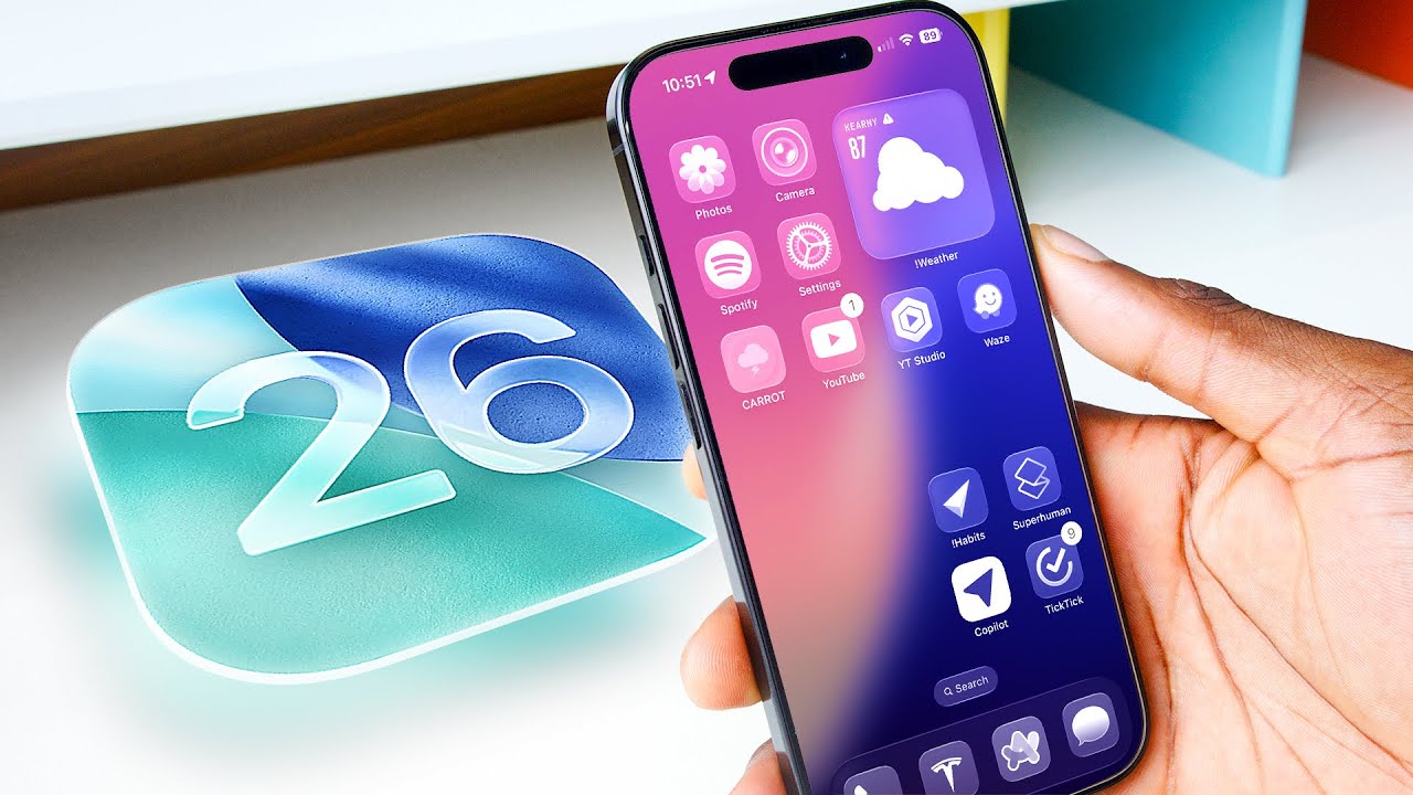
number one here in iOS 26 is Liquid Glass.
This redesign of the entire
OS from top to bottom in this new material design
style of transparency and refractions and reflections. And it's kind of polarizing, actually. Some people love it, some people hate it.
It's so polarizing actually that Apple has started
walking some of it back. So originally the idea is
just to unify the aesthetic among all of Apple's platforms, iOS 26, iPadOS 26, watchOS, macOS, tvOS, and really centering
it all around visionOS with the frosted glass
windows and the shadows and reflections of the real environment that your windows live in.
So we saw a lot of that in the keynote. I think this pulling down the lock screen, just the way it's totally unnecessarily but super impressively
distorting everything and reflecting the light based
on the colors underneath it and the angles that it hits, the theoretical layers of
glass that I'm pulling down, I think this encapsulates it all.
This is what Liquid Glass is all about. But there are some concerns, mainly around some stuff that
I brought up pretty early, which is around readability. And a lot of this is what's
contributing to the walking back that Apple has done since
that original unveil, which is like everything is clear, everything is super liquidy.
And now we're on Beta 3. And there's more places in
the OS with slightly more, you know, background blurring
and slightly less transparency just to make some text actually readable and a bit less chaotic.
So there's still the dramatic stuff like the all-clear icons. You can have a clear icon,
clear widget home screen, which is, okay, it's
impressive because on Android how many times have you
seen an icon theme pack where like, one or two icons gets left out and it just doesn't quite work?
But this theme engine just
works with every icon and widget right out the box. But then again, that's all
this really feels like it is, especially with the clear home screen is just a theme that you
might apply or might not.
Whether you like it or not, you do have to admit it is a
really, really good, detailed, well-executed theme engine. But then, so there are some
other parts of this that I like. You know, the new lock
screen I think is dope.
You've probably seen the
extended clock by now. Long press it, drag it around,
make it as tall as you want. And then once you set that,
it compresses dynamically to respond to, you know, scrolling notifications underneath it.
Super nice, fades behind
subjects into backgrounds. It's awesome. My favorite part of this new design is definitely the lock screen. But some other parts, meh.
Eh, I don't know. Like, I've personally always been a fan of clean, flat design. I don't, maybe that's
just me, that's my bias. I know that's what I prefer.
So you know, the extremely
glassy UI elements, like quick settings, you
know, the volume slider, these bubbly things, I
personally don't love them. But I'm sure over time
we'll all get used to this. But then some other parts just look straight up weird sometimes.
Like they obviously need
to try to keep things as legible as possible, and I think they're gonna
continue to update it. Like they're actively,
they're moving things between dark and light mode
depending on what's behind it, like if the content
underneath is dark or light.
And sometimes it can get wonky, especially with more complex backgrounds. You know, versus imagine if it was against a clean, flat background. It would be a lot more boring.
But this is definitely a way
more characterful aesthetic, so you can't accuse this of being boring. Some people also have
pointed out to me on Twitter that there is a reduced
transparency setting in Accessibility.
And so when you click that, most of the transparency goes away, or it kind of goes from Liquid Glass to sort of frosted glass in most places. So if you do want to turn
it off, that is available.
But I am so interested now
to see if other companies try to copy this, this aesthetic thing. I mean, we know these companies
copy each other a lot. And it would be super obvious if one of them tried to copy it.
But I don't know, is this
gonna be a sort of beginning of divergence for these softwares, where one of 'em is clean and
flat, one of 'em is bubbly, one of them is material view? Very curious to hear your thoughts.
And lemme know if you are a
Liquid Glass lover or hater, drop a comment below. Thanks for watching. Catch you on the next one. Peace.
(bright music)